|
How we represent our ideas--and our organizations--on paper and on screens is extremely important to consider. The advertising industry fully understands the power of creating powerful first impressions. In the nonprofit sphere, with scant resources at our disposal, we need to be particularly savvy about creating and selecting a few key images that 1. highlight what is special (unique) about us, and 2. effectively tell the story of our mission. Then, with positivity, optimism, and confidence, we reinforce our story through repetition. As I shared in class recently, Community MusicWorks is a good case study. Early on, we established the urban string quartet residency in the storefront on Westminster Street. The idea of the "neighborhood string quartet" became the iconic image that we wanted everyone to latch onto. Here are some examples of how we did that across various print and web materials. What immediate impressions of Community MusicWorks do these images spark? 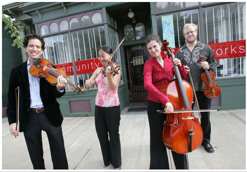 Next is my all-time favorite photo of the Providence String Quartet (and I don't care that Sara, my friend and the PSQ's founding cellist, thought she looked silly--I love that we caught a warm and personal interaction between the four musicians, still keeping the storefront as part of the story. 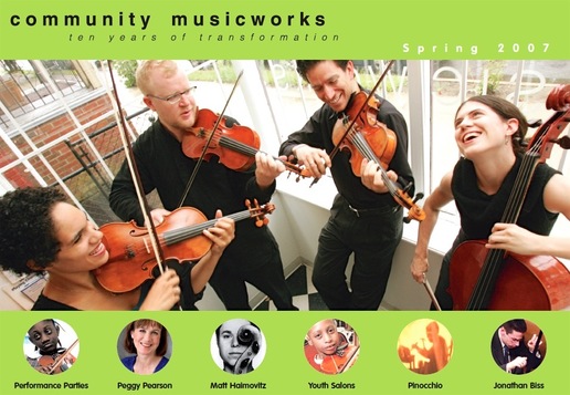 An earlier attempt was less successful... Urban, yes, but the wrong kind of urban identity: 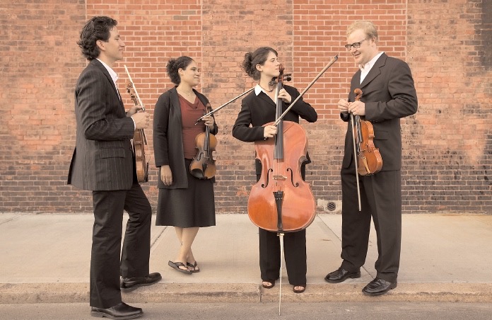 Later, when Community MusicWorks featured a larger and mixed resident ensemble, we still held onto the story of the neighborhood storefront: 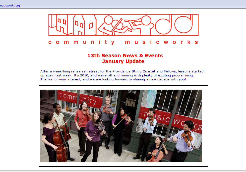
0 Comments
Your comment will be posted after it is approved.
Leave a Reply. |
AboutSharing student project documentation and, more recently, my own. Archives
June 2022
Categories |
 RSS Feed
